Space art link courtesy of me
Wednesday, November 6, 2013
Beyond Earth by Stephen Di Donato
Beyond Earth is an awesome art project by Stephen Di Donato, a Montreal-based graphic designer. He created this 60s-looking posters of the planets complete with enlarged pixels and tacky colors, nostalgic! Actually 70s is the peak of space exploration, but they’re kinda similar aren’t they? Let’s comment about these posters!
PS: he made a merchandise of these, check more about them.
Mercury. The crisscrossing lines on Mercury is probably a reference to the the numerous crack and faults (graben) on it. He also depicts the elongated orbit of Mercury. I love how he include the Sun here, personally my favorite.
Venus. This is definitely a depiction of Venus’ surface instead of its atmosphere. Reminds me of traffic lights, perhaps he was inspired from the radiant heat of an oven or something. The poster seems kinda hot as well isn’t it?
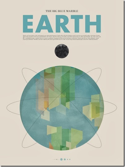
Earth. Super 60s with the nuclear-like Earth with orbits of satellites. The moon looks sinister with its darker surface.
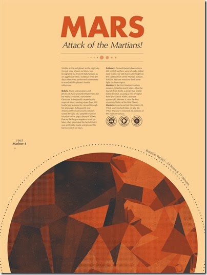
Mars. So many detailed information on this one. Those stamp-like explanations reminds me of Body Shop, I like it. Stephen also shared with us some of his older work of Mars.
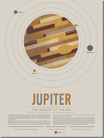
Jupiter. Not much to say, the description of Jupiter here is a bit unexpected. I love the gradient pixels.
Saturn. Good depiction of Saturn’s oblong shape, very rare with the art these days. I like those grid thing on the background, and the composition is nice. Also one of my favorite.
Uranus. To be honest I don’t really dig the depiction of Uranus here. Kinda boring, like the planet itself, so … it’s kinda appropriate I guess.
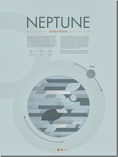
Neptune. Neptune is so grey isn’t it, if you lined this with the other planet, it looks more like Enceladus because of its whiteness, or like a greyscale of Jupiter. It does show the dynamic windy atmosphere of Neptune though. I also really like the depiction of the line with the dark and white dots, probably to mark the unique opposite orbit’s direction for Triton in respect with Neptune, but then again, should Neptune’s be all the way around, with the white dot on top and dark top on bottom? I think it should be the other way around seriously.
All and all, really stylish posters :D
Source:
stephendid.it (Stephen’s homepage)
http://www.kickstarter.com/projects/beyondearth/beyond-earth-a-poster-series (More about the projects)


