Space art link courtesy of me
Wednesday, November 6, 2013
Beyond Earth by Stephen Di Donato
Beyond Earth is an awesome art project by Stephen Di Donato, a Montreal-based graphic designer. He created this 60s-looking posters of the planets complete with enlarged pixels and tacky colors, nostalgic! Actually 70s is the peak of space exploration, but they’re kinda similar aren’t they? Let’s comment about these posters!
PS: he made a merchandise of these, check more about them.
Mercury. The crisscrossing lines on Mercury is probably a reference to the the numerous crack and faults (graben) on it. He also depicts the elongated orbit of Mercury. I love how he include the Sun here, personally my favorite.
Venus. This is definitely a depiction of Venus’ surface instead of its atmosphere. Reminds me of traffic lights, perhaps he was inspired from the radiant heat of an oven or something. The poster seems kinda hot as well isn’t it?
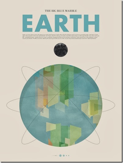
Earth. Super 60s with the nuclear-like Earth with orbits of satellites. The moon looks sinister with its darker surface.
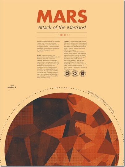
Mars. So many detailed information on this one. Those stamp-like explanations reminds me of Body Shop, I like it. Stephen also shared with us some of his older work of Mars.
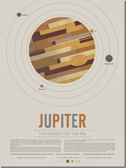
Jupiter. Not much to say, the description of Jupiter here is a bit unexpected. I love the gradient pixels.
Saturn. Good depiction of Saturn’s oblong shape, very rare with the art these days. I like those grid thing on the background, and the composition is nice. Also one of my favorite.
Uranus. To be honest I don’t really dig the depiction of Uranus here. Kinda boring, like the planet itself, so … it’s kinda appropriate I guess.
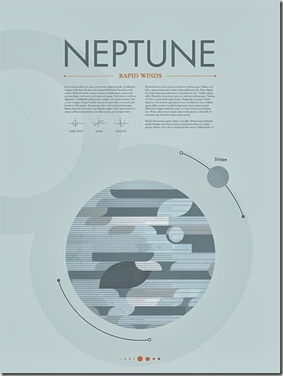
Neptune. Neptune is so grey isn’t it, if you lined this with the other planet, it looks more like Enceladus because of its whiteness, or like a greyscale of Jupiter. It does show the dynamic windy atmosphere of Neptune though. I also really like the depiction of the line with the dark and white dots, probably to mark the unique opposite orbit’s direction for Triton in respect with Neptune, but then again, should Neptune’s be all the way around, with the white dot on top and dark top on bottom? I think it should be the other way around seriously.
All and all, really stylish posters :D
Source:
stephendid.it (Stephen’s homepage)
http://www.kickstarter.com/projects/beyondearth/beyond-earth-a-poster-series (More about the projects)
Sunday, October 27, 2013
Gravity (2013) – Spoiler Alert
Do not read when you haven’t watched the movie.

Beautiful movie in its surreal depiction of space, something that most of us will never experience for the rest of our pathetic life. I LOVE this movie (watched this in IMAX 3D), even though it gets a bit boring in the middle, especially the part when Sandra and George (can’t remember the astronauts’ name in the movie) drift from Hubble to ISS.

Sure there are inaccuracies, but who care? I do!!! (haha) but in this case, the inaccuracy doesn’t kill the realism of the movie. I mean, it’s not a documentary, it’s a movie! And you don’t watch movies merely to look for the mistakes, do you? I say this movie is as close as it gets to an accurate depiction of microgravity environment. This reminds me of the movie Armageddon, one of the space-themed movie which I hate because of its horrible depiction of space: fire on asteroid? jumping? yelling? wth.
Here are some memorable scenes for me:
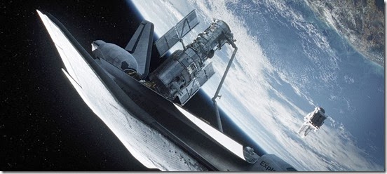
1. The beginning of the movie, with Clooney hovering around a shuttle while listening to a country music. He reminds me of Buzz Lightyear for some reason.
2. The first collision. Love how the lack of sound makes the explosion more horrifying. You can see all the scrappy details as Hubble and the shuttle seems like falling down to Earth in the background. Poor Sandra has to deal with all the mess.
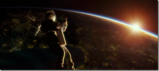
3. The emptiness. The trailer of Sandra catapulted into empty space was traumatizing, but after seeing it again and again in Youtube, it gets old. When I watched the movie I was like “yeah, saw that in the trailer”. Still, love it when the sun light turns white, red, and then black as Sandra moved further into the night side, and the moon rises… really cool.

4. I jumped when a dead astronaut appears from the mangled cockpit and the music got really loud. Dead Space came into my mind. And then: THEY MUST MAKE A DEAD SPACE MOVIE!
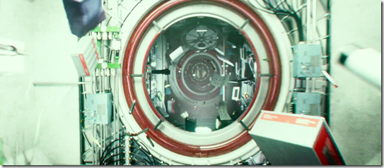
5. Sandra reached ISS and jump from point to point. Dead Space! Also there’s this floating fire and mechanical pencils floating around in the abandoned station. Very cool.

6. Sandra using a fire extinguisher? Wall-E?
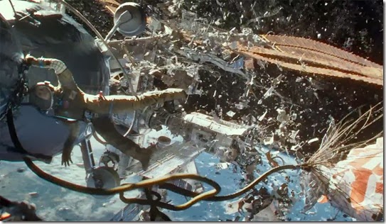
7. The ISS destroyed and fell. OMG the details… the orange parachute helps :D!
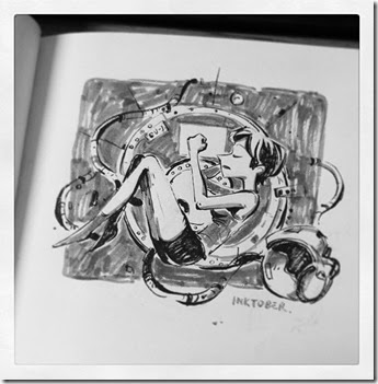
8. Let’s get philosophical! Sandra’s fetus-like position in the ISS, the lullaby, the watery scene, and Sandra merging from the water to walk. Holy metaphor!
Overall, I LOVE this movie. The simple plot makes the movie seems more realistic. There’s even moral in the end of the story! I learned that some people think that the plot is too short and simple, but personally I don’t really want a Shyamalan style plot for Gravity. To me, the simplicity of the plot actually add a good value for the movie. So I really LOVE this movie! That’s an A from me.
Saturday, October 5, 2013
David Stamatis’s 3 Juno
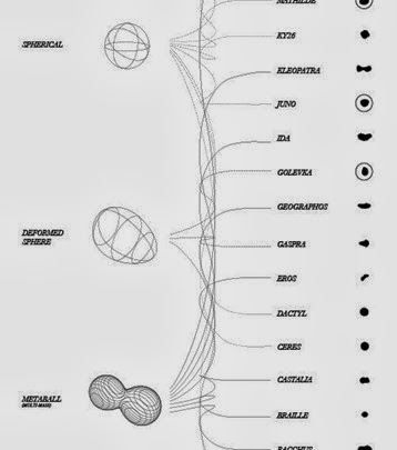
Seems that the graph explains about the nature of 3 Juno’ form, the gravity formed around the asteroid, and the interior of the asteroid? Not sure what this is…
…but it sure looks neat, especially that asteroid’s shape comparison picture!
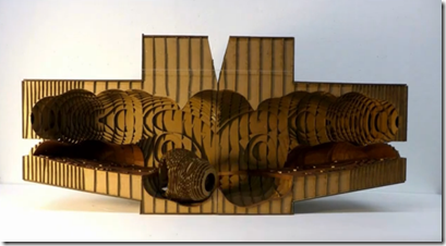
SUPRASTUDIO is one of the – experimental - studio in UCLA’s Faculty of Architecture and Urban Design. Probably similar with TU Delft’s Hyperbody, not really sure. They create some really beautiful concept of form-making. Check out this video.
Back to Juno, check out the other graph of the asteroid!

Source:
Tuesday, October 1, 2013
Historic Pegasus & Equuleus
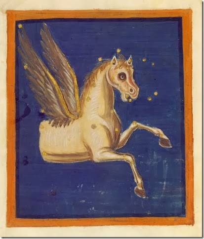
Pegasus is one of constellation with the least variation in appearance. Pegasus as we know today was depicted almost similar with the original Pegasus, although we can see the decreasing wing size.
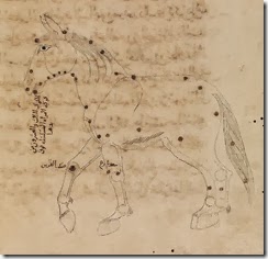
Sources said that Equuleus was first introduced by the Greeks as Ippou Protome (“bust of a horse”), but it is hard to find a Grecian image of Equuleus, so I’m not really sure. Plus there was the third horse introduced by the Muslims. So… could this be the original Equuleus?
Farnese Atlas (around 200 BC) has Pegasus in it but no Equuleus. Source: Athena’s Web Weekly Column
Leiden Aratea (816 AD). Eeeeek. Source: Leiden Aratea
Limoges Aratea (early 11th century). Equuleus not apparent in this book. Source: Limoges Aratea
9th century Assyrian scholar Hunayn ibn Ishaq. Equuleus was not apparent, but there is a constellation al Faras al Tamm made out of eastern wing of Cygnus, Pegasus’ chest, Equuleus, and Lacerta’ tail. I personally think this is Equuleus, although one sources claim it is a completely different constellation. source: Kitab Suwar al Kawakib
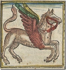
Hyginus’ Poeticon Astronomicon (1482). No Equuleus either. Source: Naval Oceanography Portal
Johannes Regiomontanus’s Kalendarius (1512). Not sure with this, but it seems that the complete Pegasus is in fact Equuleus (mentioned under the name fullen, a name for Equuleus in German). Source: Kalendarius teütsch Maister Joannis Küngspergers
A page from Peter Apian (1532) depicting Pegasus with a bridle. Noot sure if there’s Equuleus in this one. Source: Deutsche Fotothek
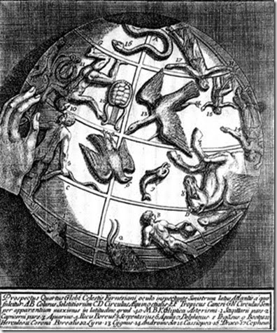
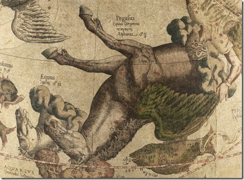
Mercator Globes (1551). To me, the earliest representation of Equuleus as a bust of horse. Source: The Mercator Globes
Zacharias Bornmann’s Astra (1596). Source: Astra
Bayer’s Uranometria (1624). Source: USNO and Rare Maps
Hevelius’s in his Uranographia (1687) depicts Aquarius’s head encroaching onto the heads of Pegasus and Equuleus. This might have significance: To compensate the father of Ganymedes, King Laomedon of Troy, for abducting his son Zeus gave him two horses. Source: Rare Maps
John Flamsteed Atlas Coelistis (1776) has an out of proportion Pegasus, very usual of his map. With his map, seems like Pegasus is losing his wings, his wings becoming smaller, almost tucked in to its body. Source: Rare Maps
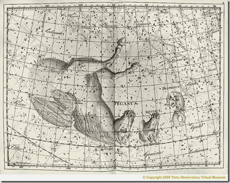
Johann Bode’s Uranographia (1801). Source: Tartu Observatory Virtual Museum
Alexander Jamieson’s A Celestial Atlas (1822). Source: Wikipedia
Urania’s Mirror (1825). Source: Selefa
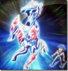
Pegasus and Equuleus cloth from Saint Seiya (1986). Source: Saint Seiya Wiki


